Delacroix and the Rise of Modern Art
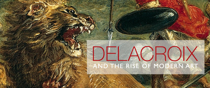
I remember my fine art lectures about the riotous Death of Sardanapalus, with its great sensually unfurling tongue of red linking what would be an otherwise chaotic narrative in a wide, dynamic, diagonal slash.
Our lecturer drew attention to the reds and greens and the blues and oranges, showing us how to read the painting and explaining their scientific significance. It was like having a curtain pulled aside to see how the masters made the magic.
So there was a methodology behind which colour Delacroix picked up on the end of his brush? He wasn't merely painting what he saw, or what he imagined, or choosing a random colour. This was serious stuff. No wonder he had such profound implications for artists such as Cezanne.

Here's a really interesting little short film which explains Delacroix's use of colour.
DELACROIX AND COLOUR
It's all about the complementaries.
The idea is that by placing a dash of complementary orange against blue, for example, it makes the blue look bluer and the orange go pop. Each colour becomes optically more intense than it would be just by itself, as you read and understand the particular qualities of a colour better by having its complimentary against it. In other words, you understand something by demonstrating its opposite.
It's only by understanding great artists and the problem they solved, such as Delacroix, that you can really have understanding and insight and depth in your own humble practice as an artist.
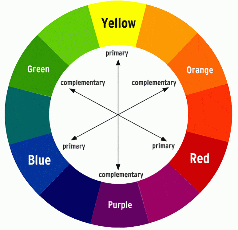
(That's complementary colours, not complimentary colours, BTW.)
No comments:
Post a Comment